
Successful membership homepages make it immediately clear who the community is for, what members get, and why they should join. They typically use simple navigation, a strong value-focused headline, clear membership benefits, prominent calls to action, an introduction to the person or team behind the community, and social proof that builds trust.
Watch me break down all 10 patterns
Above the fold, the best membership homepages quickly answer a few important questions:
- What is this?
- Is it for me?
- What do I get?
- Why should I join?
- Can I trust the people behind it?
- What should I do next?
They also make it easy for existing members to sign in and for prospective members to understand what they can expect after joining, without overwhelming visitors with unnecessary information.
Below, we’ll break down 10 homepage patterns we consistently see across successful membership communities, with examples of how you can apply each one to your own membership website.
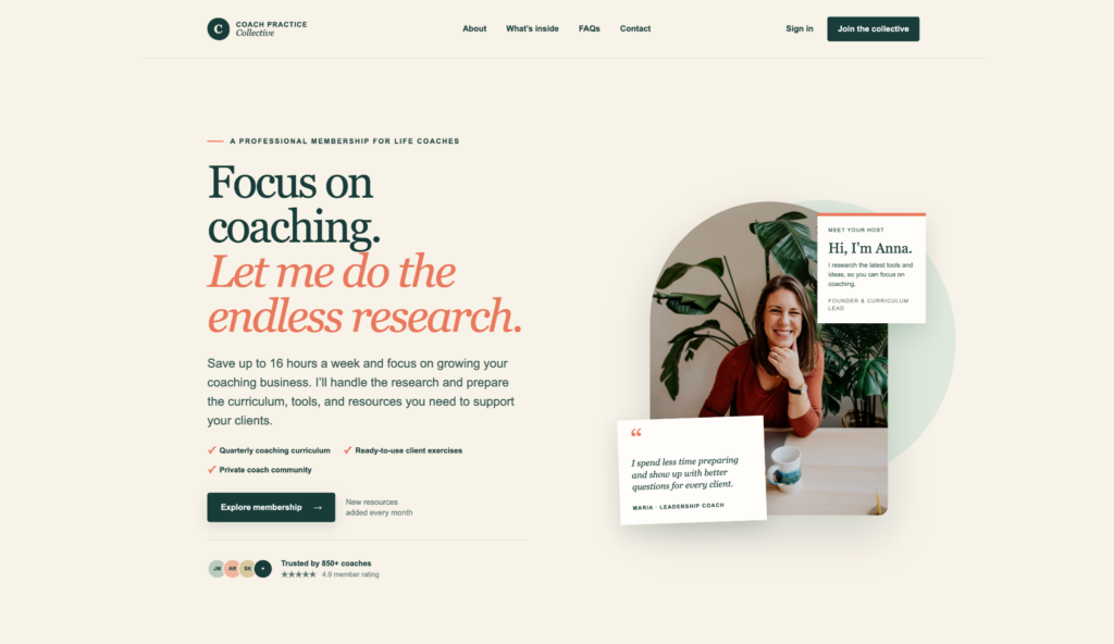
I created the fictional coaching membership website shown below to demonstrate how all 10 elements can work together within one homepage.
1. A logo and clear brand name
Your logo and brand name tell visitors where they are and help make your membership memorable.
This does not need to be complicated. A simple wordmark or text-based logo can work perfectly well. What matters is that the name is easy to see and understand.
In our example, Coach Practice Collective appears in the top-left corner, where visitors naturally expect to find it.
If someone lands on your homepage through a search result, social post, email, or shared link, they should immediately know the name of the community or membership they are exploring.
2. A simple main menu
Successful membership homepages make it easy for visitors to find the information they need without overwhelming them with choices.
A simple menu might include:
- About
- What’s Inside
- FAQs
- Contact
These links help visitors answer their questions while keeping the main focus on the membership.
Avoid filling the header with every page on your website. Too many choices can distract visitors from the primary goal, which is understanding the membership and deciding whether to join.
3. Clear Sign In and Sign Up options
A membership homepage serves two groups: prospective members and existing members.
One of the biggest differences we see between successful and unsuccessful membership websites is how easy they make it for people to join or sign in.
New visitors need an obvious way to sign up. Existing members need an obvious way to access their accounts. This is why many of the most successful membership communities place both options in the top-right corner of the homepage.
In our example, existing members can select Sign In, while prospective members see the more prominent Join the Collective button.
The two actions should be easy to distinguish. Sign In can be a simple text link, while the Sign Up or Join button should receive more visual emphasis.
4. An introduction to the community host
People do not join memberships only because of features. They often join because they trust the person, team, or organization leading the experience.
Introducing the community host makes the membership feel more personal and credible. This is especially important for coaching programs, expert-led communities, educational memberships, and professional groups.
In our example, the homepage introduces Anna beside her photo:
Hi, I’m Anna. I research the latest tools and ideas, so you can focus on coaching.
The introduction does not need to include Anna’s full biography. It simply explains who she is and why her work matters to potential members.
You can share the host’s full background, credentials, and story farther down the page or on an About page.
5. A headline that addresses the main pain point
The headline is one of the most important elements on the homepage. It should communicate a meaningful outcome or address the problem that brought the visitor to the website.
In our example, life coaches do not want to spend hours researching new ideas and preparing materials. They want to focus on helping their clients and growing their businesses.
The headline speaks directly to that pain point:
Focus on coaching. Let me do the endless research.
This is stronger than a generic headline such as “Welcome to Our Coaching Community” because it gives the visitor a clear reason to care.
Think about the work, frustration, uncertainty, or cost your membership removes. Then connect that problem to the outcome your members want.
6. A short explanation of the membership’s value
The headline earns attention. The description underneath it explains the offer.
This copy should quickly tell visitors what they gain and why it matters. In our example, the description reads:
Save up to 16 hours a week and focus on growing your coaching business. I’ll handle the research and prepare the curriculum, tools, and resources you need to support your clients.
The description connects the membership’s resources to two larger benefits: saving time and growing a coaching business.
Keep this section short. Visitors can learn about every feature and resource farther down the homepage. Above the fold, they only need enough information to understand the main value.
7. A clear description of who the membership is for
Visitors should not have to guess whether they belong in your membership.
A simple audience label can immediately establish relevance. In our example, the line above the headline says:
A professional membership for life coaches
Within seconds, the right visitor knows the membership was built for people like them. Someone outside that audience also understands that the offer may not be relevant to them.
Clear positioning may reduce the number of people who continue, but it increases the likelihood that the right people will.
You can identify your audience by profession, experience level, interest, goal, life stage, or shared challenge.
8. A short list of key membership features
After communicating the larger value, show visitors what they will actually receive.
Successful membership homepages usually highlight a few important features instead of presenting a long list. Our example includes:
- Quarterly coaching curriculum
- Ready-to-use client exercises
- Private coach community
These features make the offer tangible. They help visitors understand how the membership will deliver on the promise made in the headline.
Choose the two to four features that matter most to prospective members. Additional features can appear farther down the page.
9. A clear call to action
Once visitors understand the membership, tell them exactly what to do next.
The call to action should be easy to find and use direct language. Depending on your membership, it might say:
- Join Now
- Start Your Free Trial
- Explore Membership
- View Plans
- Apply to Join
Our example uses Explore Membership because it invites interested visitors to learn more without suggesting they must immediately purchase.
Choose one primary action and use it consistently. Competing buttons with different messages can make the next step less clear.
10. Social proof
Before joining, visitors want reassurance that other people have received value from the membership.
Social proof can include:
- Member testimonials
- Member count
- Reviews or ratings
- Customer logos
- Credentials
- Results achieved by members
- Years of experience
Our example combines a short testimonial with Trusted by 850+ coaches and a 4.9 member rating. The bottom of the page adds more trust signals: evidence-informed, coach-created, and built for real client work.
Use the strongest proof you can honestly support. A specific testimonial from one real member is more convincing than a vague claim with no evidence.
How these 10 homepage patterns work together
No single element makes a membership homepage successful by itself.
Together, these patterns create a simple journey:
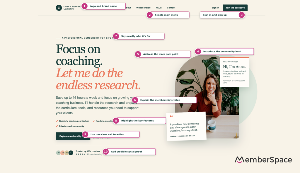
- The visitor recognizes the brand.
- They see where to find more information.
- They know how to join or sign in.
- They meet the person leading the membership.
- They recognize their pain point.
- They understand the value.
- They confirm that the membership is for them.
- They see what they will receive.
- They know what to do next.
- They find evidence that the membership can be trusted.
That is the real job of the area above the fold. It does not have to close the entire sale. It needs to create enough clarity, relevance, and trust for the visitor to take the next step.
Membership homepage checklist
Before publishing your membership homepage, confirm that it includes:
- Logo and clear brand name
- Simple main menu
- Sign In and Sign Up options
- Introduction to the community host
- Headline addressing the main pain point
- Short explanation of the membership’s value
- Clear description of who the membership is for
- Key membership features
- Clear call to action
- Social proof
You do not need to copy the exact design shown in our example. Use these patterns as a framework, then adapt the message, visuals, and experience to your audience.
Build your membership on your own website
MemberSpace lets you add memberships, gated content, and a member community to your existing website. You can keep control of your website and brand while giving members a simple way to join, pay, sign in, and access their content.
Frequently asked questions
What should appear above the fold on a membership homepage?
The area above the fold should explain what the membership is, who it is for, its primary value, and what the visitor should do next. It should also include clear Sign In and Sign Up options, an introduction to the host, and at least one trust signal.
Should Sign In and Sign Up both appear in the header?
Yes. Existing members should be able to access their accounts quickly, while prospective members need a clear path to join. Make the primary signup action more visually prominent than the Sign In link.
Should the community host appear on the homepage?
If the membership is built around a person’s expertise, leadership, or personality, introducing the host can build trust. A photo, name, role, and short explanation of how the host helps members is usually enough above the fold.
How many calls to action should a membership homepage have?
Focus on one primary action, such as Join Now, View Plans, or Explore Membership. You can repeat that action throughout the page, but avoid presenting several competing next steps at once.
What social proof works best for a membership website?
Specific, verifiable proof is strongest. This may include detailed member testimonials, membership numbers, ratings, recognizable customer logos, credentials, or measurable member results.
