The Membership Blast — 010
3 Marketing Laws Every Website Owner Must Know
Hey from sunny Chicago,
Let’s talk psychology and how the human brain actually processes information when someone lands on your website.
If you’re trying to sell a digital product, launch a paid newsletter, or grow your membership, your website is a conversation. And if you ignore how people think, you risk losing them before they even know what you offer.
These are 3 of my favorite timeless psychological laws that influence behavior, and how you can use them to make your site work better.
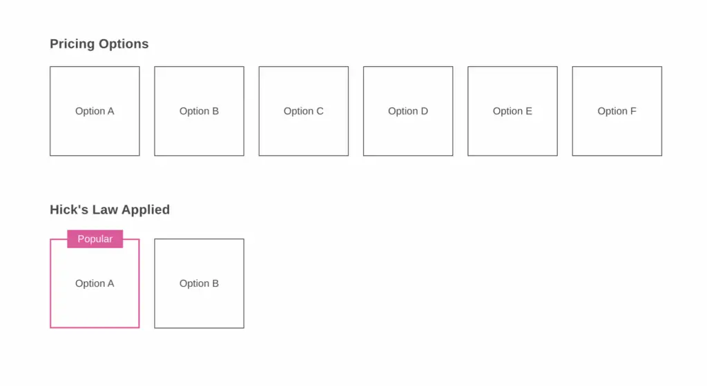
1. Hick’s Law: The Psychology of Choice Overload
When the brain is presented with too many choices, it slows down. People delay decisions or walk away entirely. Your job is to reduce friction by narrowing the options.
“The time it takes to make a decision increases with the number and complexity of choices.”
— William Edmund Hick
Where to apply this on your site:
- Pricing tables: Limit options to 2 or 3, and visually highlight the recommended plan
- Navigation: Only show the core links needed to act or explore
- Calls to action: One primary button per page
- Forms: Start with the basics. Let people add details later if needed
- Product or content listings: Use filters, bundles, or categories to simplify what’s shown
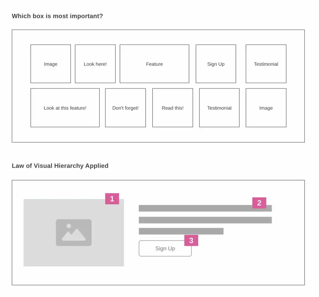
2. The Law of Visual Hierarchy: Guide the Eye, Guide the Brain
The brain does not read in order. It scans. What we see first shapes how we interpret everything that follows. Bigger, bolder, higher-contrast elements are processed first and assumed to be most important.
Where to apply this on your site:
- Page headlines: Make your value proposition the most prominent text
- CTAs: Use contrasting colors and plenty of space to make them stand out
- Typography: Use font size, weight, and spacing to create a clear visual order
- Product highlights: Use icons or bold subheadings to break down features
- Layout: Position key elements along a natural scanning path, like the F-pattern
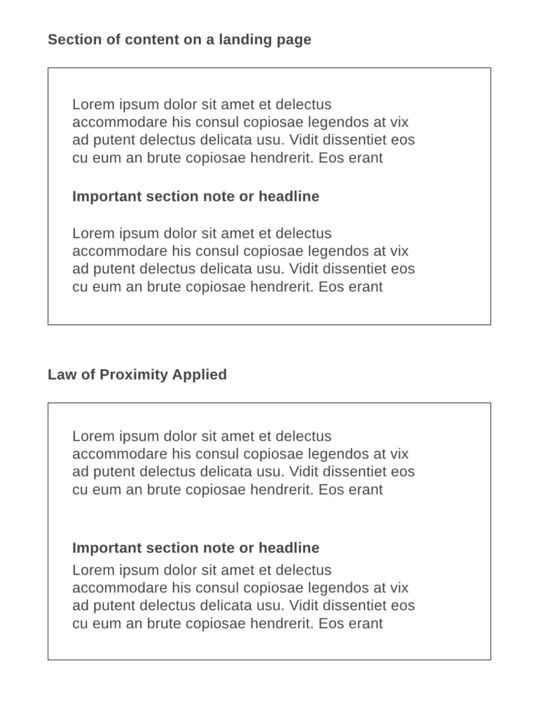
3. Laws of Proximity: Create Meaning with Spacing
The brain groups things that are close together. If your sections blend into one another or headings are too close to text, users struggle to understand what belongs together.
Where to apply this on your site:
- Headings and paragraphs: Add more space above each heading than below to create a clear break
- Content sections: Group related blocks together with consistent spacing between each group
- Testimonials: Keep the quote, name, and photo close together as a visual unit
- Pricing: Stack features directly below the corresponding plan
- Footers: Separate different link categories into logical groups
Next Steps
1. Scan your website
Look at it like a first-time visitor. What feels cluttered, confusing, or overwhelming?
2. Make a quick list
Write down 3 to 5 things to improve, like too many choices, weak CTAs, cramped content.
3. Tag each with a law
Is it about choice? That’s Hick’s Law.
Visual clarity? Visual Hierarchy.
Layout and spacing? Proximity.
4. Pick one and fix it
Start small. Tweak spacing, reduce options, or bold the main CTA.
Use these laws as a lens whenever you build or update a page. Simple shifts lead to real results.
I’ve used this exact approach on dozens of pages, and every time, it makes things clearer, cleaner, and more effective. It’s not about fancy design. It’s about understanding how people think.
Best of luck,

Marvin
Chief Growth Officer
MemberSpace